怀念王老师
转眼间,王老师离世已经快一年了。这一年里,我仍时常想起他,心中总有一种说不出的虚空与牵挂。
王老师是我高中的语文老师和班主任。说是老师,其实自毕业以来,他在我心中早已超越了这一身份,更像是一位忘年之交,甚至可以说,是我的亲人。他一路给予我关照与扶持,见证了我的成长与人生的变迁:从十几岁的懵懂少年,到如今步入中年;从寒窗苦读,到考入大学、走上职场;从成家立业,到为人父母;从国内多地辗转,到远赴海外。无论我的生活如何变迁,王老师始终是我心中不变的牵挂。他不仅是我生命中的重要一环,更是我与南京这座城市之间最深的情感纽带。
王老师一直了解我家里的情况。高中三年,我从外地回到南京独自求学,王老师对我关爱有加。在课堂上,他时常以我为例鼓励同学,甚至让我担任班长。尽管我心中惭愧,总觉得自己未必配得上那份赞誉;但正是这份信任与肯定,让我在迷茫的少年时光中,多了一份笃定与力量。课下,他还曾亲自上门探望。后来他曾说,我走过了孤独的少年、奋斗的青年,将迎来多彩的中年。那时我并不觉得自己的经历有何特别,但如今重读他微信中的文字,那份深厚的关爱与温暖,依旧如初,久久不散。
我印象尤深的是,高一那次期末考试,我还只是班上的第二十六名。三年转瞬而逝,高考时,我取得了非常优异的成绩,顺利进入理想的大学,学了自己热爱的专业,也由此踏上人生的新旅程。这一切,离不开王老师的用心栽培与默默支持。
入读大学后,我们新生被分在当时还十分偏远的校区。从市区前往学校,需要乘坐一个多小时的公交,穿过长江大桥。我至今记得,王老师和师母曾带着吃的来看我,还特意送来一双新篮球鞋。那时只觉温暖,并未多想。时隔多年,我才真正意识到——他是专程坐了那样长的车程,只为来看望我。每每想起,恩情难报,泪水难抑。
毕业之后,与王老师的联系渐渐少了。不像从前,在还没有手机的年代,反而还能写信给他。后来几次去他家拜访,当时只觉寻常,总以为还有很多机会再去看望。回头想来,那样的机会却是屈指可数。
那些年,王老师经历了多次膝盖手术、住院、再手术,在自己身受诸多磨难的同时,却始终惦记着我家的情况,关心着我的母亲。每次想到他,脑海中浮现的,始终是他那温和不变的笑容。王老师曾经历那个年代的种种苦难,回望他的坚忍与乐观,想来正是那份不变的自强精神。
再后来,我搬了家。在微信上与王老师仅有的几次交流中,他依旧像所有关心我的亲人那样,惦念着我们在这片新大陆的生活,关心疫情和中美关系是否对我们带来影响。距离虽远,言语寥寥,但我始终觉得,与王老师之间,有一种不言而喻的心灵沟通。
只是时空终究遥远,言语也终归有限。王老师年事已高,很多时候我竟不知如何开口向他表达问候与安慰。王老师离世前几个月,我们最后一次联系,他忽然提起儿时唱过的少年先锋队队歌。再后来,便突然收到了他去世的消息。内心哀痛,辗转难眠。
一天太长,十年太短。再回南京,王老师却已不在。人生中的许多事,身在其中时未必真切,往往是回首之际,方才感受到它的分量与意义。就像我读书时南京那无休无止的城市建设——喧嚣而漫长;就像和王老师相处的点点滴滴——当年未察,如今难忘。
2025.07
Train of Thoughts – 关于十年
刚刚从云上删掉了一个创建长达十年之久的虚拟机。
若是在工作中,删掉一段代码,迁移一个基础设施,也许是常有的事。甚至是值得庆祝的事。而我自己的这个虚拟机就其技术方面而言并没有什么不同。可我看着系统里的历史文件和时间戳,还是不免有些感触。因为有状态的虚拟机—— 嗯。。。是有“记忆”的。
十年,向未来看,似乎是很长的一段时间。可在我如今回过头去看,似乎又很短。
十年之间,世界在变,“我”当然也在变。而变化的核心不仅在于得到,也在于失去和告别。向过去的世界说告别,向过去的人和事说告别,向过去的自己说告别。有些不舍是应该的。因为正是过去的林林总总、点点滴滴,成就和定义了如今的这个自己。
可既然要向过去说告别,真正的问题也许是在于——什么才是我之为我的精神内核呢?是某个瞬间心灵被击中的状态?是纠缠不清的混沌迷思?还是那些不请自来的澄澈的梦?
有人说,孩子是生命的延续。这应该指的不是血缘的接续,而是生命本身,流淌的状态。我和我的孩子共同经历着生命里的一段空间与时间。可我们的所思所想却并不一定同步。这不断促使我去回想,在我如今的年纪,我的父亲、我的母亲,他们都在做些什么,想些什么?那个时候的我,又在做些什么,想些什么呢?
新的一年有很多的想法。暂且记录下这碎碎念。去年拔了很久没能下决心拔的智齿,和朋友开玩笑说,从此就是不一样的人了。谁知道呢,也许真的是!
冒泡
Thoughts on “The Absence of Field”
“The Absence of Field” is the name of Episode 3 of West World Season 3. It allegedly comes from Mark Strand’s poem “Keeping Things Whole“. After watching, my thoughts has been lingering around the name for quite some time, for its intriguing nature of imagery.
A field is intangible, yet observable, quite a resemblance to a soul. In the poem, a field is missing because of “I” stand in the way. While in the show, Charlotte is no longer herself anymore because of someone else inside her body. Either case, the absence is a mirrored way of saying existence.
Who am I then, if not part of a field? What does soul really mean, for Charlotte not being Charlotte?
“I” move, to keep things whole. Hmm… Isn’t that an echo of the idea that soul is just a pattern, an “emergence” from perpetual motion in one’s lifetime?
Thoughts on Personal Time Tracking Solution
Time Tracking and Productivity

For a long time, I’ve been searching for an ideal solution for tracking my own time usage at work.
The idea of this practice, is to promote time awareness. Time is money, people say. That is true, but meanwhile, time is also life itself. Just like how budgeting is helpful for personal financial planning, understanding how time being used could be the very first step towards making better use of life.
How I spent time at work is the part I eagerly wanted to improve on. Not just because working hours is (one of?) the biggest chunk of waking hours. But also because working as an employer, in a sense, is trading labor, experience, and knowledge for income, through time as a medium. Making efficient use of time, hence helps a worker in many different ways:
- Increased productivity that translates into either less time for the same workload, or same time with more output
- Avoid work spilled over into personal life, aka better Work-Life balance
- Grow the value in a career which is also relevant to the productivity or competitive edge
How exactly does time tracking help to improve work productivity? In my personal experience, it helps to keep focusing on the task at hand. More importantly, the data collected during the time tracking practice helps to spot the distractions. Either work-related distractions, caused by meetings, discussions, sync ups, etc. or personal activity-related distractions, such as phone notifications, IM, etc. All of these leads to context switches and that hurts productivity badly.
By practicing daily time tracking at work, I can clearly tell whether it’s a good day or bad day in terms of making good use of my time doing what I planned for. If not, what is the bottleneck? That power of retrospection and being able to audit time usage not just helps to improve productivity in the sense of efficiency, but also allows me to plan my time well.
Time Tracking Solution
Part A – Time Tracking Service – Toggl
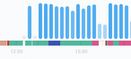
- Ratio of meaningful time or signal-noise-ratio throughout the day (categories in a pie chart)
- Daily or weekly trend of signal-noise-ratio (weekly bar chart)
- Number of context switches for a given day (timeline, num of items)
Part B – Event trigger – iOS widget, and Flic smart button
Toggl solution by itself probably is good in many cases. However, the more I use it, the more I feel a button is really one step missing for a smoother experience. Since time tracking can happen anywhere, anytime. Not always I have my laptop lid open. A button really is here to save.
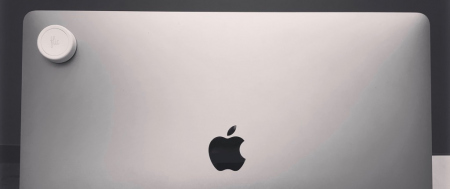
I end up using a Flic button and place it to the corner of my laptop front lid, where I can easily reach with one hand and press, regardless of laptop lid open or closed.
Flic is a smart button that has bluetooth connection either pair with a smartphone or Flic hub. Once pressed, the real action is up to you to choose from a rich ecosystem. In my case, I hooked it up with IFTTT and from there to Integromat (will talk about that later).
Believe it or not, having an easy-to-access physical button for time tracking, not just making the task much easier, but also gives you a lot of time-in-control confidence psychologically. (•̀ᴗ•́)و ̑̑
It’s worth to mention that, virtual buttons are also helpful on occasions. The virtual buttons I use are from the Integromat app and can be added as iOS widget. With widget, I’m only one swipe away from those virtual buttons even when the phone is locked. That is way much better than opening up an app. I mainly use the virtual buttons when the physical button not around or for the initial troubleshooting setup.


